The Elegance Trap: Why Over-Designed Websites Lose Sales.
We've landed on that website before.
You know the one: It has stunning background videos, sleek animations, and typography that looks like it belongs in a design competition.
But within seconds, you find yourself already wondering...
"Where's the menu?"
"How do I contact them?"
"What do they actually do?"
And that is the problem: a website can look impressive and still fail its most important job: helping people.
Of course, having a professional and attractive website matters. A good first impression influences how people see a business. However, when appearance becomes more important than usability, design stops being helpful and becomes a barrier.
Your Clients are on a Mission (Don't Distract Them)
Think about settling down for a film night on Netflix. You spend 20 minutes scrolling through trailer auto-plays, endless categories, and dynamic covers. Instead of enjoying a movie, you end up overwhelmed by choices and give up.

Online shoppers experience the exact same choice paralysis.
When your clients visit your site, they usually have a single goal: find a service, check a price, or solve a problem. Packing a site with heavy visuals, abstract layouts, or constant motion triggers friction. Instead of feeling guided, visitors feel lost.
When people feel confused online, they don't stick around to figure it out—they hit the back button and head straight to a competitor.
Match your Design to your Purpose.
One common mistake is copying sites built for entirely different audiences.
An interactive, experience-heavy site works well for brands like Apple, where visitors are exploring and comparing features. It also makes sense for visual industries like:
- Photographers and artists
- Fashion designers and architects
- Creative studios
For these businesses, the portfolio is the product.
However, a local builder, trader, accountant, nail salon, marketing company, flooring company, or landscaper, serve a different audience looking for quick, direct answers:
'What services do you offer? How much does it cost? Can I call you today?'
For local services, straightforward clarity builds far more trust than elaborate visual effects.
When "Too Perfect" Feels a Little Suspect..
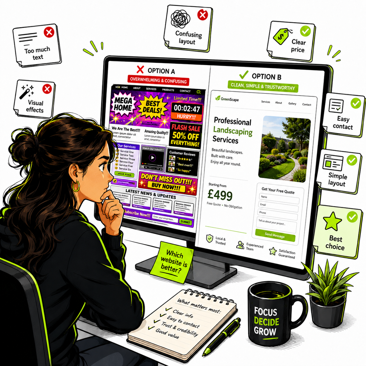
There is a fascinating psychological flip side to over-designing. When a website is incredibly polished but hides essential business information, like clear pricing, direct contact details, or straightforward explanations of what you actually do, it starts to raise red flags.
In the digital world, transparency is currency. If a site feels too complicated or evasive, skeptical clients might subconsciously wonder, "Is this a scam? Why are they making it so hard to see the real details?..."
More so, a truly great design should reveal information clearly, never bury it behind aesthetic smoke and mirrors.
The real problem of "Sleek" Fonts & Contrast.
One of the biggest issues with modern, minimalist web design is the obsession with microscopic font sizes and low-contrast text. While thin, light-gray text on a white background might look ultra-chic to a designer looking at a high-end monitor, it is an absolute nightmare for real users in the real world.
Think about elderly audiences, or even anyone trying to read your site on a phone while walking outside in bright sunlight. If a potential client can’t comfortably read your text, they aren't going to buy from you. Real design consideration means putting the audience first. Your layout has to be inclusive, highly legible, and easy for everyone to use.
Many highly stylised websites also overlook WCAG (Web Content Accessibility Guidelines), an international set of recommendations that help make websites usable for everyone, including people with visual, hearing, or motor impairments.
What Is WCAG and Why Does It Matter?
Many highly stylized websites overlook WCAG (Web Content Accessibility Guidelines) an international set of recommendations designed to make websites usable for everyone, including people with visual, hearing, or motor impairments.
This includes four key principles:
- Perceivable: Information must be easy to process (e.g., high contrast text, alt text for images).
- Operable: End users must be able to navigate easily, including using keyboard-only or voice controls.
- Understandable: Content and navigation patterns must be clear and logical.
- Robust: The site must work across different devices, browsers, and assistive technologies.
Accessibility isn't just about supporting people with disabilities—it improves the experience for every single visitor.
Your Website Needs to Work on the Device People Actually Use.
(Horizontal Scrolling & Broken Layouts)
One of the biggest mistakes businesses make is designing mainly for desktop. A website might look perfect on a large screen but feel completely different on a phone.
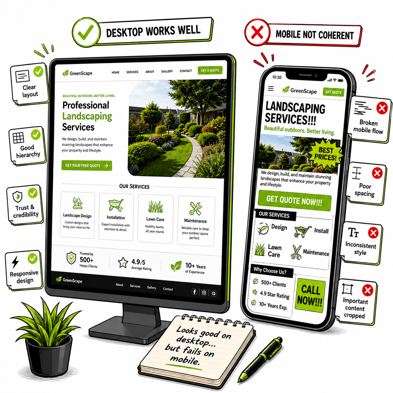
- The Problem: Multi-column desktop layouts or large interactive canvas animations do not always adapt cleanly into a vertical mobile screen.
- The result? Users may have to zoom in, scroll sideways, or struggle to find basic information. A website should adapt naturally to the device someone is using.
This is why designers follow a mobile-first approach: creating the best experience for smaller screens first, then expanding it for larger devices.
When Animations Become a Distraction..
- Animations can create a premium feel when used sparingly. However, excessive movement, autoplay videos, and complex scroll effects slow websites down and make navigation frustrating. For some users, constant movement can even cause motion discomfort.
This is why designers use a mobile-first approach.
Simply put, it means creating the best experience for smaller screens first, because that is where many customers will visit from.
Effortless Connections Build Trust.
When someone is looking to hire a service, the fastest way to build deep trust is to make yourself accessible; people want to know they can reach a human being without jumping through hoops. If a "perfect" layout buries your phone number, hides your email behind three nested menus, or forces users through a frustratingly complex contact form just to keep the homepage looking pristine, you are actively losing business. A straightforward, effortless connection is the ultimate trust builder.
At the end of the day, good design isn't about how many flashy elements you can fit onto a screen. It's about how quickly and smoothly you can connect a client’s problem with your solution. Don't let the quest for aesthetic perfection break that connection. Keep it clean, keep it readable, and above all, make it incredibly easy for your users to take the next step.